Visual Communication in the Context of Change Management
Everything has its worth. Especially something rare. This particularly applies to the amount of time dedicated to information. We all appreciate that one of the biggest challenges in change management is to ensure everyone understands what is at stake, why the project has been launched and how it will be rolled out. How can we make this change come to life in those brief 12 minutes of attention span[1] which your teams can attribute to your organisation? You have one ace in your hand: visual communication.
The economy of attention: a challenge for all organisations
We receive more and more mails; guidelines grow like mushrooms. Social media have become the new vectors of information. And today the office has been moved to home. This is why we talk about the “never off culture”. But managers still need to make themselves heard to convince their teams, to motivate their teams, to align them to any changes: in daily business, concerning their attitudes to work, tools, strategy, …
Nowadays, our information consumption seems to follow the same trend as our meals: we are becoming less and less inclined to spend a lot of time reading newspapers or voluminous reports, but much prefer “snackable” content. In 2014 we “consumed” 100,00 words a day: that is equivalent to a novel with 500 pages. Say goodbye to words and welcome images.
An image is processed 60,000 times faster by our brains than a text.
We all know that the messages linked to understanding and accepting change are not easy to get across at any time without adding any additional obstacles. Visual communication or information design can help to create coherence, as well as improving the employee experience. Surely, this is a win-win!
Information design in a corporate context
Information design is a response to the need for effective written communication.
It has evolved from the analytical and graphic processing of abstract or complex content material with the aim of not only providing the right information, but also ensuring that it is understood and assimilated by the target audience. It combines attractive presentation with functionality and proves that a support can be simultaneously full of information and visually attractive.
One of its main advantages is that it really can transmit an important piece of information and exert a direct influence on its user. This differentiates it from a graphic support, as it fulfils a functional purpose and also seeks to be attractive, although its main purpose is to ensure that its reader understands the message in question.
Why is visual communication so effective?
To understand this approach, you need to analyse a visual communication on the basis of its visual appeal and/or the level of information it represents (functional representation). A well-prepared visual support needs to be both functional and attractive, as we are all visual creatures; in fact, 95% of our relationship with the outside world is based on visual receptors.
By associating a high level of information and functionality with an attractive format, the information in question becomes easier to understand and retain. If used in a corporate context, such support material will not only ensure that key messages and information are more readily accepted and applied by the employees concerned, but will also encourage them to adopt a certain attitude or to undertake a specific measure as a result.
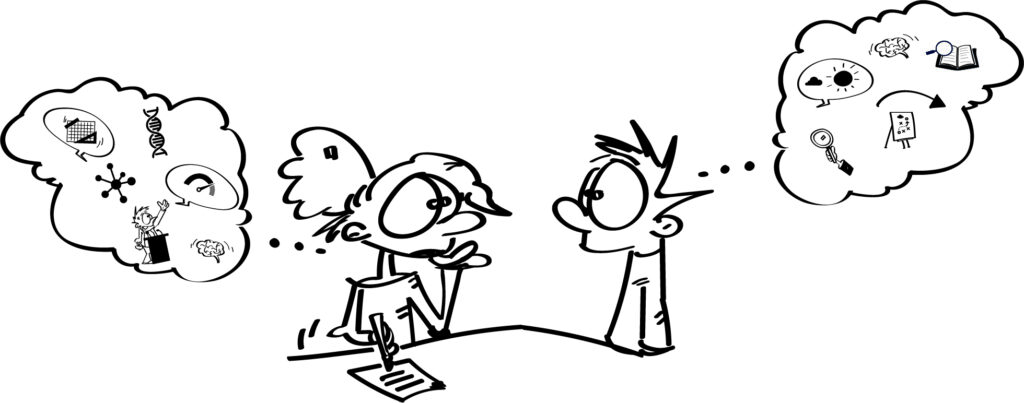
What are the next steps? How can we use these methods?
Our approach makes it possible to appraise a wide variety of different information and then identify the most important messages, which are then illustrated and used to create a useful support, which every user can immediately use.
- Immerse yourself … in the context;
- Understand… the request;
- Structure… the information;
- Produce a concept … for the support material;
- Illustrate… an infographic or cinematically;
- Propose a support … that is useful, usable and used.
Each phase adds a layer of added value to the final result. The initial phase must identify the most important information to replicate in the final version and which will structure the information to transmit. By framing the subject in question to suit the final users, it is possible to separate each piece of information whether obvious or hidden and then to attribute real needs to each one. The phase of information structuring aims to select, sort and prioritise the main subjects to include in the support. This is then followed by the conceptual phase, when the final version is designed. During the next stage, you will need to work on the texts, choosing a suitable graphic style and layout, which is coherent with the aim of the support and the information, which needs to be transmitted. Then the work is done!
That is what you call the iceberg effect: you can’t even see 70% of the work involved.
Methods you should take into account
To achieve a successful change also means taking various modern challenges and new methods into account. Social media are constantly supplying a wide range of visual content and rival with each other for greater visibility. 30% of all Internet searches start on Google Images and this is even more common for any searches conducted using a smart phone.
This makes it clear that all visual content creation needs to be adapted to take current graphic trends into account. What is the colour of 2021? 2020 was the year of blue and pink shades, but next year they will be succeeded by the “brave ground”, a very light brown, you might even say beige. A return to the earth to add an idea of nature to every creation.
Responsible design is also an up and coming trend. This means reducing print output and limiting the number of images, which have a direct influence on the energy input required to save such images on world-wide servers.
Did you mention a dynamic image? Yes, motion design and videos are useful, pedagogical visual supports and can be used to announce a change or to encourage its acceptance. Don’t forget to think mobile! Bear in mind that smart phone users consume material at an even faster rate and are less attentive. The good news is that when used in an internal corporate context as opposed to in social media as a whole the audience is more captive.
One last piece of advice: stay short and be concise. The era of “snackable content” is here to stay…. Just like information design.
[1] Source: Nouvels Obs de 2016 – the period of time most (French) employees can concentrate on something at work without being interrupted.
WANT TO RECEIVE OUR LATEST THOUGHT LEADERSHIP CONTENT?
Related posts
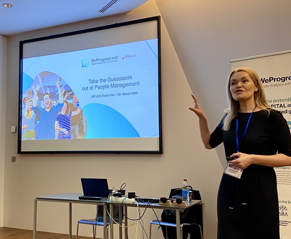 Take the Guesswork out of People Management
 From processes to people: achieving quality
 Daring to lead Positive Transformation: What if Positive Emotional Capital was your key to sustainable change?
 Why hire Change management professionals? We can do it alone!
 Digital Transformation and Change Management: Lessons shared in an event hosted by Cebi and MindForest